

Movie key art plays a crucial role in capturing the audience’s attention and conveying the essence of a film. It serves as the visual representation that can make or break a movie’s success at the box office. In this blog, we’ll explore the essential elements that contribute to the effectiveness of movie key art and how they stand out in a crowded marketplace.
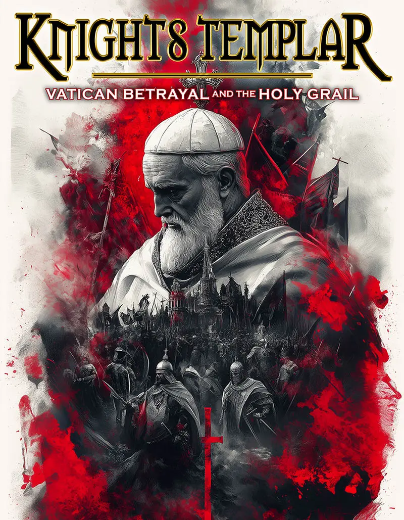
Element 1: Compelling Imagery
Using striking and relevant images that evoke curiosity and excitement is essential for standout key art.
Imagine walking past a movie poster that instantly catches your eye. The imagery used in that poster needs to be captivating enough to pique your interest. Elements like main characters, action shots, or even a striking landscape can pull viewers in. Every frame tells a story, and the key art should encapsulate that narrative essence.
Furthermore, the imagery must reflect the film’s tone and theme. For instance, a horror film might use dark, ominous visuals, while a romantic comedy could lean towards brighter, more whimsical images. This connection between visuals and genre helps audiences know what to expect, guiding their decision-making process.
Additionally, utilizing unique artwork can set a movie apart from others. Hand-drawn illustrations, mixed media, or stylized photography can create a distinct aesthetic that resonates with target audiences, making the movie unforgettable.
Element 2: Strong Typography
The choice of fonts and layout can significantly enhance a movie’s brand and message, making it easier for viewers to remember.
Typography isn’t just about picking a pretty font; it’s about conveying the film’s personality. A bold, heavy typeface might suggest action and intensity, while a delicate, script-like font could evoke feelings of romance and elegance. The art of pairing these fonts appropriately can dramatically influence how a viewer perceives the film at first glance.
In addition, the placement of the text matters just as much. The title should be easy to read and positioned prominently to ensure that it catches the observer’s attention immediately. An effective hierarchy within the text layout also helps prioritize information, guiding the viewer’s eyes to key elements.
Remember also to consider how typography interacts with imagery. A successful combination creates visual harmony, with the text complementing rather than clashing with the images. This synergy is vital for creating an overall cohesive look that leaves a lasting impression.
Element 3: Color Scheme
A thoughtful color palette can elicit emotional responses and set the tone for the film, drawing viewers in.
Colors have a psychological impact, influencing how we feel at a glance. For example, warm colors like reds and yellows can invoke feelings of excitement or urgency, making them suitable for action-packed films. Conversely, cooler colors like blues and greens might be more appropriate for dramas or thrillers, evoking feelings of calm or suspense.
Moreover, consistency in color usage across various promotional materials strengthens brand identity. When viewers see a specific color scheme repeatedly, they begin to connect it with that movie, enhancing familiarity and recognition. This connection can play a crucial role in a potential moviegoer’s choice to watch the film.
Balancing color intensity is also crucial. An overwhelming palette can confuse or deter viewers, while a well-calibrated combination can enhance the visual appeal significantly, leading to a successfully striking art piece.
Element 4: Clear Branding
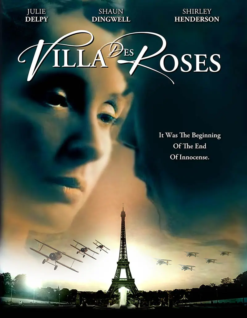
Key art must prominently display the film’s title and essential branding to ensure it stands out and is easily recognizable.
Without a doubt, clear branding is a non-negotiable aspect of effective key art. The title should be easily readable and positioned where viewers can see it immediately. Beyond the film’s title, elements like the studio logo or actors’ names can bolster recognition and draw in specific audiences who may already be fans.
Additionally, maintaining consistency with existing branding is important. If a studio has a signature style or logo, integrating it into key art not only reinforces brand identity but also provides a sense of familiarity for audiences. This can instill trust and increase the likelihood of viewership.
Finally, don’t underestimate the power of memorable taglines. A catchy phrase paired with the visual elements can create an emotional connection, leaving viewers wanting to know more about the film.
Element 5: Unique Style
Incorporating a distinct artistic direction that aligns with the film’s genre can help the key art differentiate itself from others.
Every movie has a unique story to tell, and the key art should reflect that unique voice. For instance, an animated feature may benefit from whimsical, playful illustrations, whereas a gritty drama may opt for stark, photographic realism. Such distinct styling not only attracts attention but also sets expectations for the type of experience viewers can anticipate.
Moreover, standing out in a sea of competition is crucial, and taking creative risks can pay off. Unique design elements—like unconventional layouts, unexpected visual elements, or even interactive components—can create memorable impressions that linger in the minds of potential viewers.
Finally, it’s important to keep evolving and experimenting. Trends in design change over time, and remaining fresh and innovative can ensure that a movie’s key art continues to resonate with current audiences while not feeling stale or outdated.

Wrapping Up: The Art of Key Art
In summary, effective movie key art combines creativity, clarity, and emotional engagement. By understanding the core components that make key art successful, filmmakers and marketers can create visually striking pieces that resonate with audiences and boost a film’s appeal.